Comment

125 Years of GSA Annual Meetings Animated

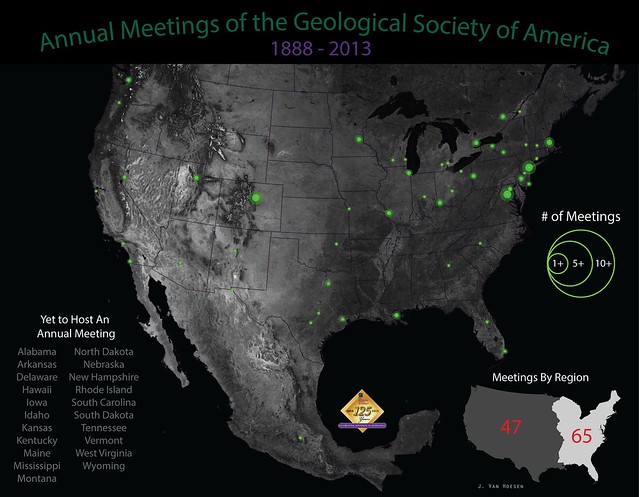
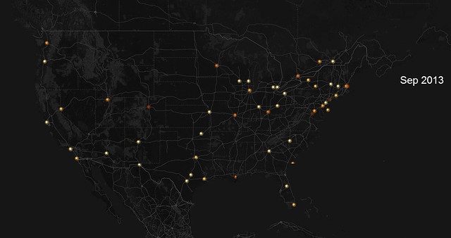
This year marks the 125th Anniversary of the Geological Society of America and the annual GSA meeting is about a month away (October 27-30) and will be held in Denver, Colorado. I was curious about the geographic distribution of historical meetings so I tracked down this reference, which provided locations from 1888-1980 and filled in the rest using the GSA's website. Using QGIS and Illustrator I created the graphic below, trying to capture the relative distribution of meetings throughout the U.S., Canada and one meeting in Mexico.
Note: this graphic only depicts annual meetings not all the section meetings.

GSA Meetings (1888-12013)
Note: larger sizes available here

But this static graphic doesn't really capture the temporal aspects of annual meetings locations (primarily held east of the Mississippi River during the early years of GSA). So the animation below allows for a slightly better understanding of how these meetings slowly started migrating to the west starting in the 1980s. You can click here or on the image below to see a full-screen animation. The animation was created by compiling all the meetings by date, uploading to CartoDB and then using their awesome Torque.js library to animate using the date column.
GSA-Torque Animation

Comment

Comment

The Flaming LIPs Tour - 3.5 Billion Years and Counting

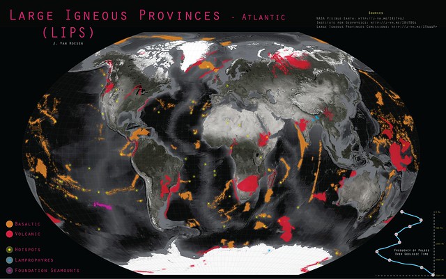
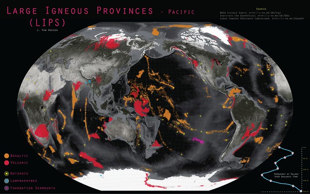
This week a post by Geomorphology Rules on Facebook prompted me to celebrate "Worldwide LIP Appreciation Week." Much to the disappointment of Steven Tyler, this is related to Large Igneous Provinces. I couldn't find any other reference to this as the official week of celebration, however it seemed like a great topic to mention in my Intro to Geology course. But when I went looking for a good map of LIPs I was disappointed, so I decided to create one.

I started with some Blue Marble imagery from NASA and following some great advice from John Nelson with idvsolutions applied a little desaturation and knocked down the brightness in the bright white polar regions. I found ready-made shapefiles (LIPs, hot spots, etc) created by Mike Coffin and provided by the Institute For Geophysics at the University of Texas, Austin. I also used a dataset from the Large Igneous Provinces Commission to create a simple graph illustrating the frequency of igneous pulses over geologic time (this is meant more as illustrative than definitive - of course). 

Cartographically I chose the orange and red based on the USGS Cartographic Standards pallette and the yellow, blue and purple mainly for contrast. I re-projected all the data into Winkel-Tripel (see Goldberg and Gott (2008) and Comparing Map Projections). I couldn't figure out how to reproject to Winkel-Tripel in QGIS so that was done in ArcMap 10.1 and then symbolized in QGIS and exported to Illustrator for the marginalia (I know, I know I could use Inkscape but we have a site license...)

So hopefully you find this map useful and I welcome suggestions if you'd like to see something changed or find an error! Other sizes are available for the Atlantic Ocean here and Pacific Ocean here.

UPDATE: September, 16th to include views of both the Atlantic and Pacific Ocean basins.
Large Igneous Provinces - Pacific
Large Igneous Provinces- Pacific

Comment

1 Comment

The PowerPoint Conundrum in Geoscience Education

Microsoft released PowerPoint in 1990 and Edward Tufte published his criticisms of PPT-based presentations in "The Cognitive Style of PowerPoint" in 2006 and yet 7 years later I open up the latest edition of GSA Today to find that Erich Cheney still needs to write an article titled "No More Lousy PowerPoint Slides." To be clear, I agree completely but I don't understand why this continues to be an issue... (although, apparently it is also an issue for the National Security Administration).

Eric's criticism is ultimately a commentary on how earth scientists communicate scientific theories and results or rather, how often this process is done poorly. His article - while informative and well-written - isn't groundbreaking, I believe his point was (by including a reference from 1965) to gently chide presenters to be more thoughtful and actually utilize the resources that convey best practices. While most geoscientists are probably not also graphic designers, there are guidelines and there are templates and there are resources to reference when building presentations. Some of Eric's concerns involve overarching design principles and others are simple - like exporting an image at a higher resolution so it isn't pixelated or ensuring there is sufficient contrast to view your content. The latter can often also be double-checked at our home institutions on projections screens...

So the conundrum for me is that best principles have been described and explored for decades (at least). My favorite book - and one of the best written on this topic - by Tufte is "The Visual Display of Quantitative Information." The ideas and concepts about design and ensuring proper scaling, coloring, shading, etc. of different types of quantitative data, rich with examples and suggestions isn't something you routinely see as required reading for geoscience students. So while I agree it is important students can properly collect lineation data with a Brunton or run an XRD, then what? Is Excel sufficient?  Should they be using R to learn a little coding in addition to producing a graph? How and in what course do they learn what colors are appropriate? Should they be creating static images or developing interactive web-based products? Undergraduate vs graduate curriculum? 

Clearly the attention to presentation design that effectively communicates our research/ideas/etc hasn't been integrated into much of the curriculum or we wouldn't still be seeing yellow serif fonts on white backgrounds at professional meetings... This isn't a screed directed outward as I too am guilty of not incorporating these ideas and concepts into my geology courses as often as I should. Pointing them to resources like visua.ly or datavisualization.ch isn't enough because they still need to learn a software package like Illustrator/Inkscape or understand how to make sense of Javascript libraries.


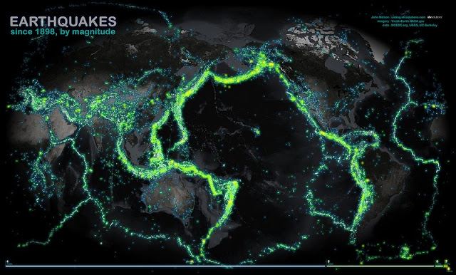
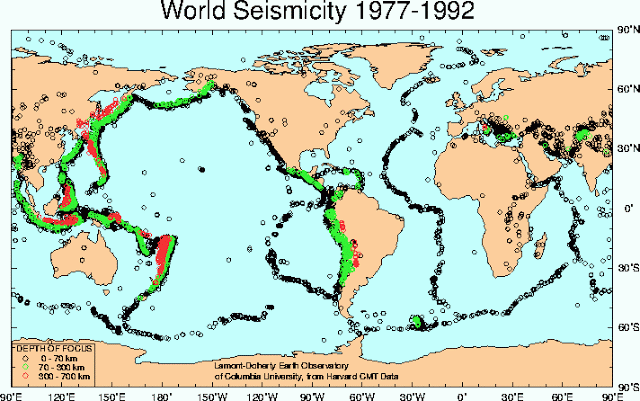
This is more of an open question about how/whether geoscience programs can/should respond to Eric's plea for a better and more professional approach to sharing results and findings with both peers and external audiences. A recent visualization by John Nelson with IDV Solutions really underscores the difference between thoughtful visualization versus a traditional technical approach to sharing earthquake data. I think you'll agree that the first image is easier to interpret (and 'prettier') than the second.

1 Comment

1 Comment

My GIS is Better Than Yours (and other lies)

First, a disclaimer - this is a bit of a rant but I will do my by best to make it non-judgmental and hopefully express some ideas that I've spent a good deal thinking about the last few years but only recently had to grapple with on a professional level.

In 1997 I began my foray into the world of Geographic Information Systems  (GIS) by deciding it would be a good idea to learn how to transform my mundane (and smelly) blueline-based geologic map into a magical and digital masterpiece (this was but one of many disappointments in my life). My tools were a Sun Workstation (no, I don't remember the model or how little RAM or how slow the CPU was, but it didn't matter then) and PC/ARCINFO. It was a learning experience to say the least, mainly in the art of troubleshooting and self tutoring (oh, and self-restraint by not taking a sledgehammer to the entire lab). By self-tutoring, I mean the joy that was "Understanding GIS - The ARC/INFO Method." 
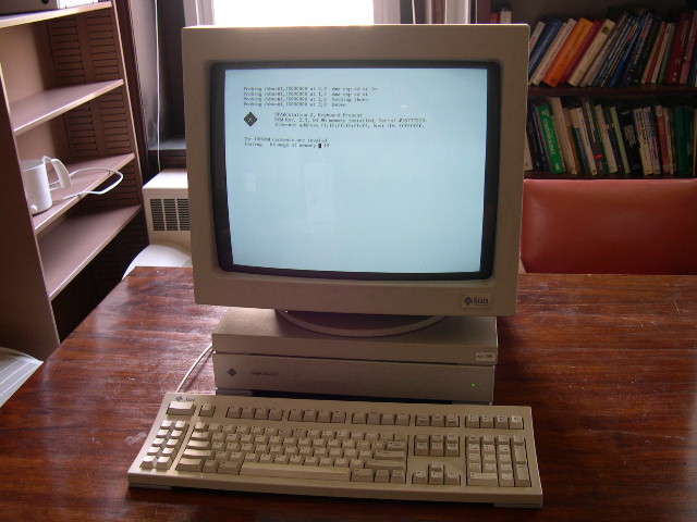
  
I miss these fantastic machines...
(source: http://j-vh.me/188FyOc)

My first semester in graduate school at UNLV (circa 1998) I thought mana had fallen once again when introduced to ArcView 3.0 - what a PRETTY GUI you are! The thrill subsided after the honeymoon of course (I obviously no longer think it's a pretty GUI) and I fought many a segmentation violation (in my mind I always came out victorious). I completed some 'official' coursework in both an introductory course and an advanced spatial modeling course and learned A LOT through trial and error (read that as repetitive and humbling failures) and integrated it as much as possible into research endeavors. So I definitely learned the ropes through a specific platform and software suite but there are numerous options for harnessing the power of a GIS using that foundational knowledge. And therein lies the rub.

Academics like definitions and I'm often wearing that hat, so here's a wordy book definition for a GIS:
A system of hardware, software, and procedures  designed to support the capture, management, manipulation, analysis, modeling and display of spatially referenced data for solving complex planning and management problems” - Rhind, 1989
Software is only mentioned once in that list of attributes (yes, I did that on purpose) and yet, the platform and software get all the attention and has become a means to define the 'system'. So here's where I get ranty: neither the operating system or flavor of software should be the mechanism by which we judge the analyses or the product  nor in the academic sector, how we effectively articulate and teach the fundamentals of using a GIS

When I first read The GIS 20: Essential Skills I thought - with few exceptions - I could teach most of these with PC/ARCINFO; I wouldn't WANT to, but I could. Just like I could teach most of these essential skills with any number of FOSS alternatives. Which will draw the inevitable chiding that by doing so (that is, by not teaching one specific software package) I would be doing a disservice to my students. Well, I don't buy it. Colleges and universities have the luxury of academic pricing (one way to make the masses demand a product on departure) and therefore every fall or spring I teach the latest and greatest version of any software package I happen to be using (hint, hint - wink, wink). And I too use these great products because I can (you would too, don't lie) but the argument that marching into the world, diploma in hand - with evidence of proficiency with a specific software package - is required to stand in for a proficiency with geospatial literacy doesn't hold water for me. 

BUT job postings specify it you say? Sure they do. And I have colleagues working for non-profits, state agencies and the NPS who are still using 10 year old software. So sometimes (and perhaps this is the exception) there is a disconnect between the folks writing a job announcement and the environment where a new hire might end up working. In this fabricated alternative reality I've concocted (if you're using 10 year old software, blow up the comments section please) should I be making decisions based on software or what is necessary to understand how to create and query a database (no, I didn't specify a geodatabase) to produce a cartographically accurate and aesthetically pleasing visualization? Yeah... I'm going to go with the latter too.

The GIS&T doesn't specify software, the GISP certification doesn't specify software, and the Geospatial Competency Model (GCM) doesn't specify software... So let's be honest and admit your GIS isn't better than mine (or theirs). You might be more comfortable using a certain suite (life-long learning anyone?), you may have written special scripts (pssst, you migrated from AML - Avenue - VB - Python, you will be OK), and you might enjoy a semi-seamless integration between various products (I get it, I do) but it doesn't make one version, suite or option better.

To be clear, I'm not advocating for software in either direction (proprietary or FOSS), I'm urging educators and employers to think about what we should be teaching and what skills and expertise they want recent graduates to have (I'm leaning away from monkeys who know how to click buttons in the right order, but let me know...). Hopefully it's clear this isn't a diatribe against a company or a choice to use a particular software package per se, but rather about the trend towards defining a GIS by the platform it's using.
1 Comment

Comment

Animated Travels in the Scotia Arc - GSA125

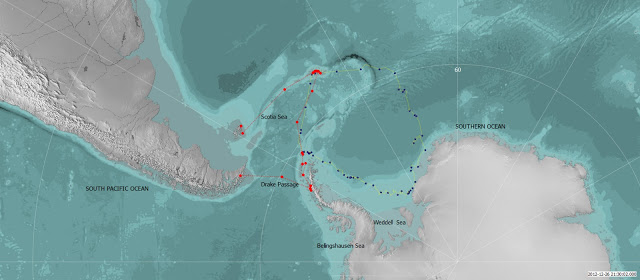
I just wanted to post and share a short animated video showing the path the Akademic Ioffe followed on the Geological Society of America's Antarctica field trip. This trip was the 'kick-off' to the GSA's 125th Anniversary celebration.

I created the animation using QGIS with the Time Manger Plugin, data from Natural Earth and the Shackleton's Expedition Google Group. The red dots and lines represent the Ioffe and the blue dots and yellow track represent the Shackleton Endurance Expedition. I am planning on building this same project out in an nice TileMill interface. 

 
Static Map of the Akademic Ioffe Tracks
 

Comment