Microsoft released PowerPoint in 1990 and Edward Tufte published his criticisms of PPT-based presentations in "The Cognitive Style of PowerPoint" in 2006 and yet 7 years later I open up the latest edition of GSA Today to find that Erich Cheney still needs to write an article titled "No More Lousy PowerPoint Slides." To be clear, I agree completely but I don't understand why this continues to be an issue... (although, apparently it is also an issue for the National Security Administration).
Eric's criticism is ultimately a commentary on how earth scientists communicate scientific theories and results or rather, how often this process is done poorly. His article - while informative and well-written - isn't groundbreaking, I believe his point was (by including a reference from 1965) to gently chide presenters to be more thoughtful and actually utilize the resources that convey best practices. While most geoscientists are probably not also graphic designers, there are guidelines and there are templates and there are resources to reference when building presentations. Some of Eric's concerns involve overarching design principles and others are simple - like exporting an image at a higher resolution so it isn't pixelated or ensuring there is sufficient contrast to view your content. The latter can often also be double-checked at our home institutions on projections screens...
So the conundrum for me is that best principles have been described and explored for decades (at least). My favorite book - and one of the best written on this topic - by Tufte is "The Visual Display of Quantitative Information." The ideas and concepts about design and ensuring proper scaling, coloring, shading, etc. of different types of quantitative data, rich with examples and suggestions isn't something you routinely see as required reading for geoscience students. So while I agree it is important students can properly collect lineation data with a Brunton or run an XRD, then what? Is Excel sufficient? Should they be using R to learn a little coding in addition to producing a graph? How and in what course do they learn what colors are appropriate? Should they be creating static images or developing interactive web-based products? Undergraduate vs graduate curriculum?
Clearly the attention to presentation design that effectively communicates our research/ideas/etc hasn't been integrated into much of the curriculum or we wouldn't still be seeing yellow serif fonts on white backgrounds at professional meetings... This isn't a screed directed outward as I too am guilty of not incorporating these ideas and concepts into my geology courses as often as I should. Pointing them to resources like visua.ly or datavisualization.ch isn't enough because they still need to learn a software package like Illustrator/Inkscape or understand how to make sense of Javascript libraries.
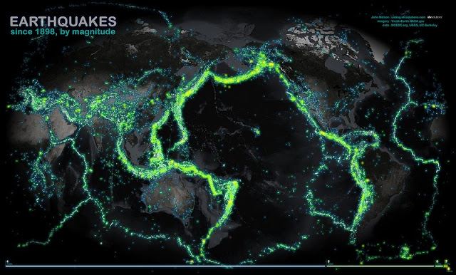
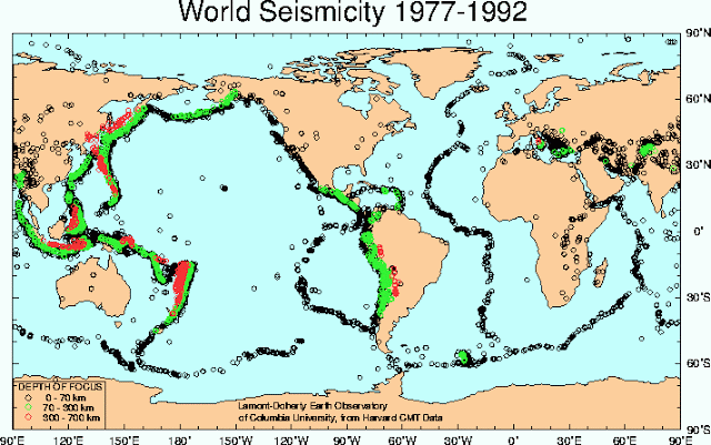
This is more of an open question about how/whether geoscience programs can/should respond to Eric's plea for a better and more professional approach to sharing results and findings with both peers and external audiences. A recent visualization by John Nelson with IDV Solutions really underscores the difference between thoughtful visualization versus a traditional technical approach to sharing earthquake data. I think you'll agree that the first image is easier to interpret (and 'prettier') than the second.
Source: http://j-vh.me/13RUDXa
Source: http://j-vh.me/15FqTNg

