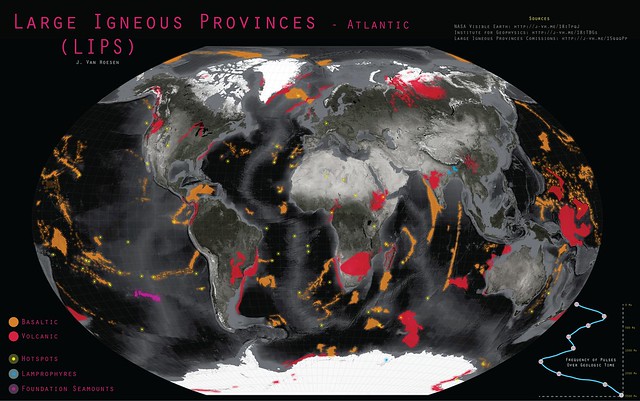
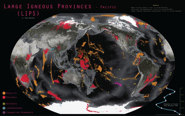
This week a post by Geomorphology Rules on Facebook prompted me to celebrate "Worldwide LIP Appreciation Week." Much to the disappointment of Steven Tyler, this is related to Large Igneous Provinces. I couldn't find any other reference to this as the official week of celebration, however it seemed like a great topic to mention in my Intro to Geology course. But when I went looking for a good map of LIPs I was disappointed, so I decided to create one.
I started with some Blue Marble imagery from NASA and following some great advice from John Nelson with idvsolutions applied a little desaturation and knocked down the brightness in the bright white polar regions. I found ready-made shapefiles (LIPs, hot spots, etc) created by Mike Coffin and provided by the Institute For Geophysics at the University of Texas, Austin. I also used a dataset from the Large Igneous Provinces Commission to create a simple graph illustrating the frequency of igneous pulses over geologic time (this is meant more as illustrative than definitive - of course).
Cartographically I chose the orange and red based on the USGS Cartographic Standards pallette and the yellow, blue and purple mainly for contrast. I re-projected all the data into Winkel-Tripel (see Goldberg and Gott (2008) and Comparing Map Projections). I couldn't figure out how to reproject to Winkel-Tripel in QGIS so that was done in ArcMap 10.1 and then symbolized in QGIS and exported to Illustrator for the marginalia (I know, I know I could use Inkscape but we have a site license...)
So hopefully you find this map useful and I welcome suggestions if you'd like to see something changed or find an error! Other sizes are available for the Atlantic Ocean here and Pacific Ocean here.
UPDATE: September, 16th to include views of both the Atlantic and Pacific Ocean basins.

